What Is an Analogous Color Scheme?
While the design process can seem like it comes from a place of feeling, there's certainly a science to it. So when it comes to selecting your home's color scheme and you're in need of guidance, simply turn to the color wheel. If you know a monochromatic look isn't for you but you want to build off of one color you love, go for an analogous color scheme. “This type of pairing employs [three] colors that are next to each other on the color wheel,” says designer Katie Hodges. “They usually vary only slightly in pigment and intensity.”
Ahead, dive into all of the details about the design rule.
What is an analogous color scheme?
The three aligned shades of analogous color schemes usually work like this: One acts as the “dominant” shade and is used to ground the rest of the look. The second color is labeled as the “supporting” hue that provides texture throughout the space. And the final option is the “accent” that pops against the others. When used correctly, an analogous color scheme can create the type of warmth you’d want to feel in any room.
Why do designers love analogous color schemes?
An analogous color scheme can easily tie a space together. “It exudes a sense of serene harmony while still maintaining a boldness in the design,” Hodges says. “Because the colors tend to be somewhat tonal, it really allows for a room to be designed with the big picture in mind rather than around one bright focal point in the space.”
Our Favorite Analogous Color Scheme Ideas:
If you’re interested in creating an analogous color scheme in your home, here are some options Hodges recommends.
Black, Brown, and Tan
A black, brown, and tan color scheme can do wonders in any room, but it’s one of the Hodges's favorite dining room combinations because "it creates an essence of sophistication and formality without coming across as too fancy,” the designer says.
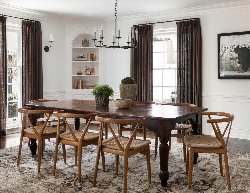
“These colors work well together because even the slightest variation in tone creates a new layer and element of depth,” Hodges continues. “It’s important to use the black sparingly, and consider texture and color intensity in every piece. For instance, this dining room’s moodiness is balanced by the wood danish cord dining chairs—if those were dark brown, the design would fall flat.”
Black, Charcoal, and Gray
Another fairly neutral analogous color scheme to turn to is black, charcoal, and gray. Hodges recommends using this color scheme to build out the furniture pieces in your space, like a sofa, chairs, and tables. "This is a great way to coordinate pieces without having them look too matchy,” she says.
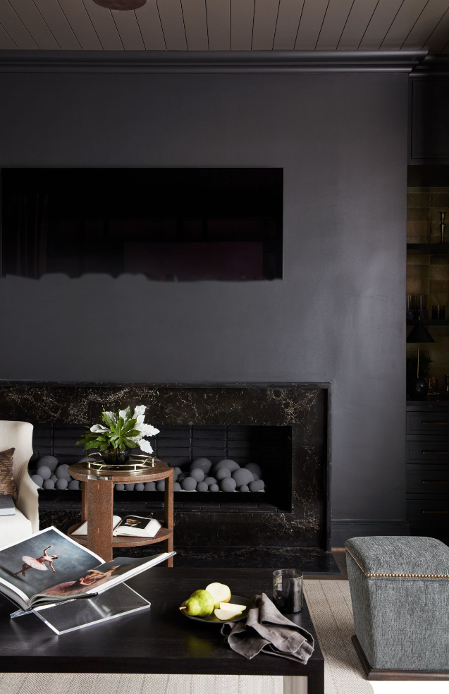
Not to mention, the colors are timeless and allow you to incorporate other brighter ones through your art and decor. Hodges notes an important tip to keep in mind: "Make sure to create enough contrast between each item, depending on the layout of the room and the placement of the items within it.”
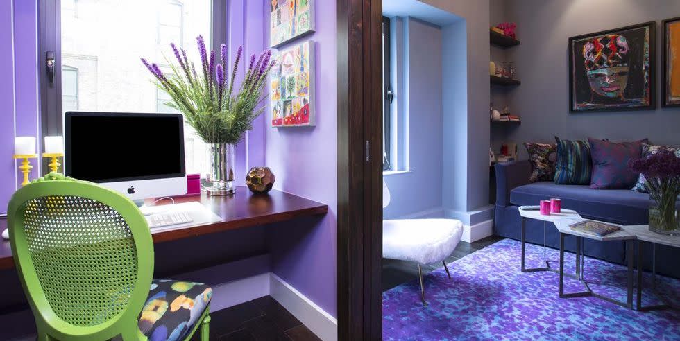
Blue-Green, Blue, and Blue-Violet
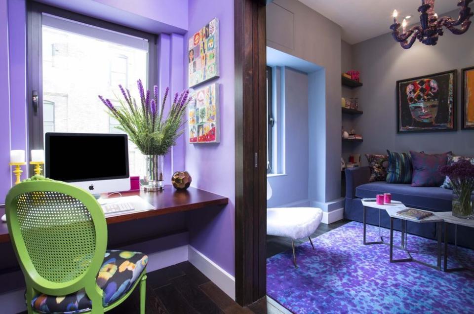
If you're looking to go a bit bolder with your color selection, turn to blues like blue-green, blue, and blue-violet. “This color combination is perfect for a playroom or kids' room because it can read as either feminine, masculine, or both,” she says. “The blues are cooler in tone, and the slightly warmer violet provides the necessary contrast. I recommend blue-violet as the ‘pop’ here, and the blue-green as the contrast.”
You love finding new design tricks. So do we. Let us share the best of them.
Follow House Beautiful on Instagram.
You Might Also Like

