"I can defend every single step of my work", Jessica Hische on how she avoids logo controversy
- Oops!Something went wrong.Please try again later.
Jessica Hische is an American lettering artist who also teaches, owns physical stores, writes and illustrates picture books, and many more things besides. I met her on her 40th birthday, just before her talk at OFFF Barcelona, where she talked the audience through what she's learned each decade of her career. It was an uplifting and inspiring talk, and our chat was no different, spanning why people get mad about logos changing, how she always tracks every step of her creative process and which social media platform she'd join if she was starting out today.
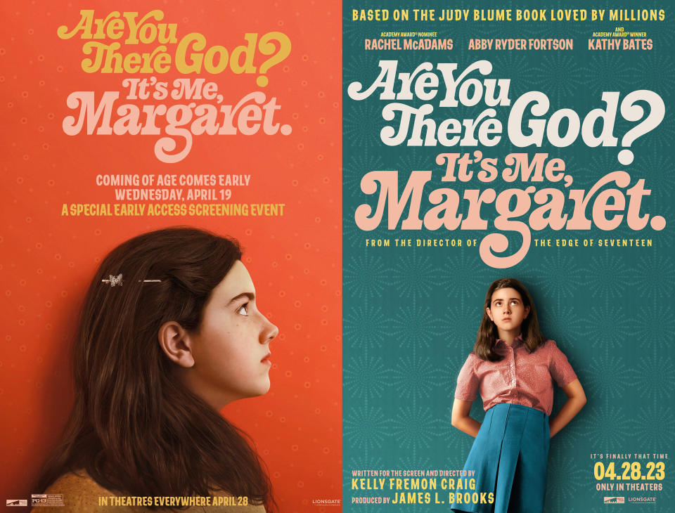
We've already published sections of our conversation, including whether creatives should work for free, all about her picture books and how she crafted the film titles for Are you there God, it's me Margaret. Read on for more of our chat...
What challenges do you face when you’re refreshing a really well-known logo?
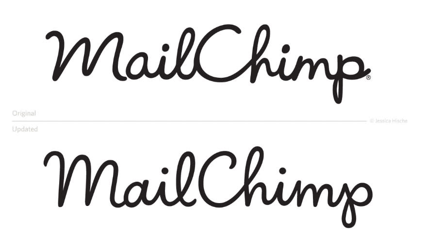
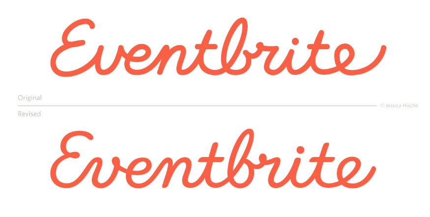
Well, when you're working on a really well known logo, it's constantly paying homage to the history, or what's been there, while being extremely utilitarian about the work that you're doing. They came to you for a reason, there's something they're trying to fix or update or a thing that is bugging them about the existing one. And you have to make sure that you keep really good documentation of the things they have come to you with, the problems that they want to solve, and offer the best solutions for those problems.
The reason why I love that kind of logo refresh work is because it is so utilitarian
For me, the reason why I love that kind of logo refresh work is because it is so utilitarian, because a lot of times the solutions are very clear. I see the logo, I see that two of these letters are drawn in a totally different style than the other letters because someone over time decided to mess with it but didn't have the knowledge.
Or I can see there's really high ascenders and really low descenders and that makes it hard to work with. I’m always trying to solve for these extremely specific utilitarian problems and just make the asset way easier to work with because my goal, which I tell clients is, sure we can make a 50-page brand book of the best ways to use this logo, but I want to make you a logo that's so easy to work that you don't need that. That's so intuitive to work with that you don't need the world's best designer designing around it. We're solving all of the problems so that you don't have to be like using 1,000% brain brainpower to figure out how to make a lockup with it.
Do you ever get a brief where you think the logo doesn’t need changing?
There are times when I'm like ‘this is much closer to the end’, but there's usually always something, even if it's just spacing. A lot of times that people come to me and say, ‘This doesn't scale very well, it looks great big but doesn't look good small.’ And I'm like, ‘okay, well, maybe our whole goal here is to decide if we want to make this logo scalable. Or if we want to make a second logo that's for use at small scale if you love this logo.’
Usually there's something that needs to be addressed or a lot of times what will happen is they have the logo, the logo itself looks great, but they have a new brand system and it doesn't vibe within the brand system. And then it's about what small changes can we make to this that make it match the new brand system better? Sometimes it's simple stuff like adjusting contrast or adjusting the width of letters a little bit, something like that, or the x-height. It can be very subtle, but it's all just meant to make it all feel more cohesive.
Have you ever faced a backlash from your logo work?
Thankfully I haven't. But I think that's just because of the nature of the work because I'm not doing rebrands. Occasionally you'll get a few dissenters that are like ‘it's better where it was’. But to me, I'm just like, ‘it was so bad before how could you possibly think that?’
I can defend every single step of the work that I do
It also comes back to the defending your prices thing. I can defend every single step of the work that I do. It's not like I'm just posting and and being like, ‘here you go’. I usually talk through like why I'm doing things, like, ‘the stroke angle is different on this ‘l’ compared to this ‘l’ so we made it consistent. And sometimes people are like, I liked it when it was quirky’. And that can work, if there's enough quirk. Mistakes are great if there's enough of them. If there's one mistake it's like your eyes are just pulling right in on it. It's a natural human pattern recognition thing, it’s like a safety [mechanism] for us, that's why we do that. When we're out in nature, when we see something that's different, we're afraid of it, because it generally means that it's not natural and not good for us.
Can you tell me about your first ever commission?
My very first commission was to create a logo for a voice artist. I don't know how they found me, but I was still in college. They needed an album cover that was for a CD and it was to double as a logo. It was just black and white art with hand lettering with a microphone and it was very, like cut-paper style, that was my earlier style. There was also a mural that a restaurant paid me to do in my hometown, which was a very bad Picasso-y, abstract painting of guitars.
How did you build your business from there?
When I was first starting out I had a really good network of other freelance illustration friends and I took on an artists rep really early on as well. I was working with an artist rep from when I was 22. He didn't really want to take me on at the time, because my portfolio wasn't super cohesive yet. But then I did this one project that was illustrating the 12 days of Christmas, and I feel like I really nailed the style that I wanted to work in at the time and he saw it as well and was just like, ‘Okay, well, let's do this because I feel like I see the future in this’.
So part of it was his connections because at the time artists reps were more important for illustrators, like now they sort of act as out of house studio managers more than anything, I think. But at the time, one of the popular ways to promote yourself as an artist was to have an agent. That was really helpful.
I feel like word of mouth and actually just being really present online before a lot of people were [was helpful]. I was really early to Twitter. And when I launched my Daily Drop Cap project, I launched it on Tumblr. I feel like being a part of those early social networks really helped. One of the reasons why it helped was because there weren't as many artists there so it was easy to stand out. When you're talking to a bunch of web designers about your art, they're like, ‘look, art!’ Everyone's excited to have you there. And now I feel like it's a different challenge because everybody is on every social media network. So it's harder to stand out.
Try to find groups of people outside of your immediate peer group
One of the pieces of advice that I always give to young designers is try to find groups of people outside of your immediate peer group to not only be friends with because it's fun to make friends with different interests, but also if you're the one designer that they know, anytime someone asks them ‘do you know a designer?’ They’ll say, ‘yes, there's one designer and that's her’. Whereas if you only hang out with other designers, or illustrators it's not often a referral factory like it can be for people outside of your industry.
If you were starting out today, what social media platform would you join?
There's been a lot of talk recently about how important it is to actually have a website again, like I think a lot of people really divested in their online websites. But then because so many of the social media sites are so ephemeral there's not like a way for a creative director to see a consistent portfolio from you. And so having a website or just having a portfolio posted somewhere where they can get a real snapshot of your work I think is really important.
Having a website or a portfolio posted somewhere I think is really important
And then in terms of social network, it really just depends on what kind of work you want to be doing. If you are really interested in content creation and video work, there's platforms that are better for that. If you're not interested in that, there's platforms that are better for that. I think it makes sense to be on all of the social media platforms that bring you joy, and make you happy to be there. And if you're not happy to be there, it's not gonna serve you. I'm not a TikTok person, because I'm not happy to be there. But I was so happy to be on Twitter when it was good. And very sad when it became bad and Threads has sort of become my Twitter fallback, and I'm happy to be there. And I also don't mind being on Instagram even though Instagram used to be much more of a sort of friends platform and has become more of a professional work, networking platform.
Find out more about Jessica Hische and OFFF Barcelona.

