Every 2024 Color of the Year We Know So Far
Behr Paints
A new year is just around the corner and paint brands have already started announcing their colors of the year. Color, whether through paint or decor, is the simplest way to evoke a feeling in a room. These colors range from traditional to truly unexpected, setting the bar for just how creative we can be in our homes. Whether you're looking for tones that evoke tranquility and calm, or just want to spice things up with something unexpected, The Spruce has got you covered.
Here's our ongoing guide to all the 2024 colors of the year we know so far. And since they're so wide-ranging, you're sure to find a color that speaks to your personal style.
Ironside by Dutch Boy Paints
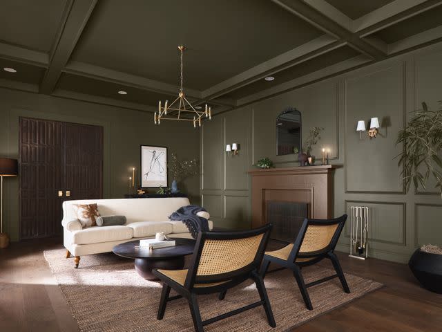
Ironside is a deep olive shade with black undertones. While the color exudes moody mystery, it's also very comforting. Though it's not a true neutral, Ironside is a versatile color that could work in any room without being overwhelming. Ironside presents a new take on green's association with calmness and nature, the black undertone adds an additional level of sophisticated charm that makes this a timeless hue to add to your home.
“Our main driving influence for our color of the year is creating a space for wellness," says Ashley Banbury, Dutch Boy Paints' color marketing manager and interior designer. "A sanctuary in your home that can not only help you physically but mentally as well."
Persimmon by HGTV Home by Sherwin-Williams
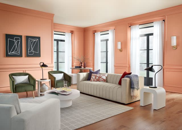
Persimmon is a warm, earthy, and energetic terracotta shade that combines the elevated energy of tangerine with grounded neutral undertones. Pairing well with neutrals or even as an accent color in your home, this energetic color will rejuvenate your space and fit in perfectly in rooms where you want to promote conversation.
"We are transitioning into a time where the home has become a way for personal expression, bringing in shades that are unexpected and comforting," says Ashley Banbury, HGTV Home® by Sherwin-Williams color marketing manager. "We have seen these tangerine tones emerging in consumer trends and decor and they are having a larger presence in the home.
Renew Blue by Valspar
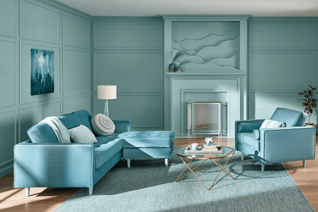
Renew Blue is a tranquil light blue shade with touches of grayed sea green. Pulling from nature as inspiration, this stunning shade is perfect for mixing and matching throughout your home. The shade truly can be used anywhere and pairs wonderfully with other colors both warm and cool.
“Renew Blue offers limitless design possibilities while emphasizing control, consistency, and equilibrium within the home,” says Sue Kim, director of color marketing for Valspar. “Our home is a space where we are creating a sense of comfort and slowing down.”
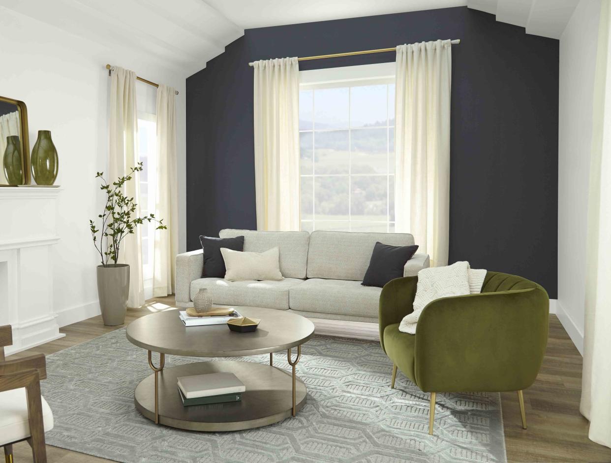
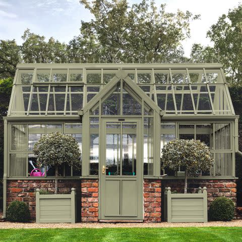
Cracked Pepper by Behr
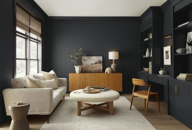
A color that works well in both interior and exterior spaces, Cracked Pepper is Behr's "soft black" color of the year. Even with neutral shades being a staple in most spaces, people are leaning more towards incorporating darker shades throughout their homes and Cracked Pepper is the perfect paint for the job.
“Cracked Pepper is a color that empowers and elevates your senses—it really elevates the way we feel in a space," says Erika Woelfel, the vice president of color and creative services at Behr Paint. “It’s a timeless color, modern color that brings sophistication into any room in your home."
Limitless by Glidden
Limitless is a versatile buttercream hue that can work in most, if not, all spaces regardless of the room's purpose. Its name embodies its ability to complement a variety of colors and mix well with either existing decor or any new renovations. The warm and vibrant color will bring cheer to any space and give the ultimate glow-up.
“We are entering a new era of explosive creativity and change,” says Ashley McCollum, PPG color expert for Glidden. “Limitless understands the assignment and embodies this perfectly.”
Bay Blue by Minwax
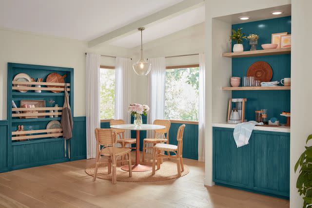
Courtesy of Minwax
Nestled between a blue and a green, wood stain aficionado Minwax announced their color of the year to define 2024, Bay Blue. The shade rings energizing, fresh, and grounding, bold enough to make a statement but neutral enough to suit any room or style, as seen in the kitchen above.
“Bay Blue is at the intersection of contemporary and classic,” Sue Kim, the director of color marketing for Minwax, says. “The 2024 Color of the Year is a rich shade that elevates and enhances the natural wood within our homes.”
Thermal by C2 Paint
C2 Paint
A light blue shade that manages to be both calming and energizing at the same time, Thermal is C2 Paint's 2024 color of the year. While it may seem impossible for two polarizing emotions to combine, Thermal is all about contrasting emotions colliding: the shade envokes invigoration and energy but its soothing undertones make this color perfectly versatile.
"This bespoke pale yet punchy blue is poised for adventure and brimming with hope, evoking feelings of loyalty, trust, and confidence," Philippa Radon, interior design and C2 Paint color specialist, says. "Its contradictory nature has the dual ability to uplift us and provide a sense of calm and tranquility."
VIRIDIS by Graham & Brown
Graham & Brown
Graham & Brown's 2024 color of the year creates a warm and welcoming space, perfect for rooms where you want to invoke a sense of calm for your guests or yourself. This soft, muted green provides a perfect, colorful alternative to the sad greige we're used to seeing.
"Viridis, a soothing mid-green hue reflects harmony and stability, enabling those in its vicinity to relax and revitalize," said C2 head of design, Maryanne Cartwright in a press release. "Viridis is the color of growth and health, mirroring nature and expressing renewal and life. It evokes a feeling of abundance and a plentiful environment."
Read Next: 4 Color Palettes You Need in 2024, According to Sherwin-Williams
Read the original article on The Spruce.

