This Californian city’s logo drama is getting even messier
Last month, the City of Visalia unveiled its new logo design – much to the dismay of its residents. The Californian city had previously held on to its traditional logo for over 20 years, so when the change was announced it was natural that some folks had strong opinions (many of them negative).
Logo design isn't easy and it's typically best to accept that you can't please everyone, but it seems that Visalia didn't get the memo. Instead of rolling with the punches, the city has backtracked on its new logo design (sort of) by reviving the old design in tandem with the new controversial design. To make things even more confusing, the City of Visalia is now reopening applications for a new, new design. Let's hope the third time's a charm.
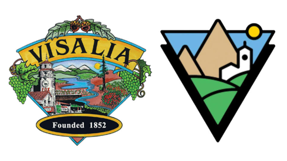
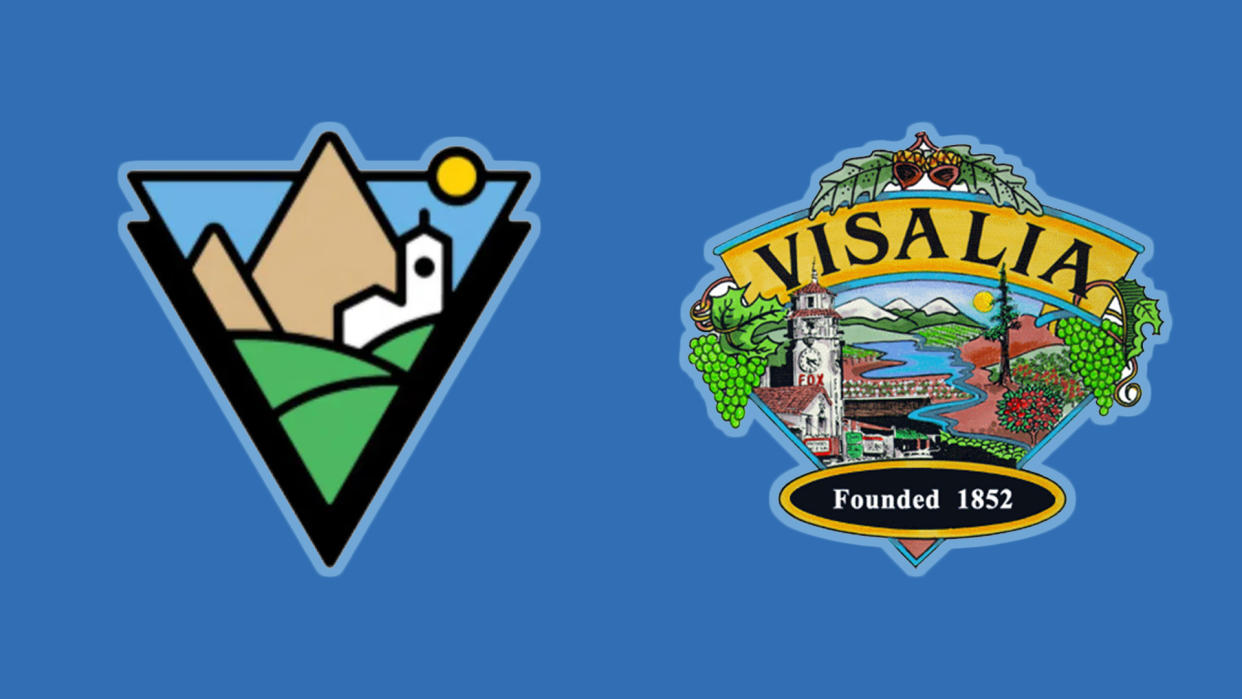
The old Visalia logo (now reffered to as the 'Legacy Logo') was elected 20 years ago in a public vote, showcasing the city's Fox Theater clock tower alongside, fruit trees, vines and snow-capped hills. Traditional, tasteful and thoughtful, the design was somewhat dated but beloved by residents, so when the new look dropped it clearly had a lot to live up to. Predictably, the new logo was met with ridicule and backlash, with Instagram users comparing it to a "clip art from a Windows 98 computer" and a "minimalist corporate logo".
The new design is fairly innocuous, but it seems that's the main cause of contention. It features a simplified geometric design of layered triangles with subtle gestures to the old logo motifs such as pyramid-esque 'hills' and a fairly primitive rendition of the classic clock tower. As part of Visalia's costly $150,000 rebranding project, I find myself sympathising with residents, who feel the new design was "wasting time and money on a bland redo of something that wasn’t broke and didn’t need fixed."
A post shared by City Of Visalia (@cityofvisalia)
A photo posted by on
"You had the perfect opportunity to showcase one of the many artists born and raised in Visalia… this rebrand has NO character and is a slap in the face to all your local artists," one Instagram commenter wrote, feeling that the design snubbed local talent. In response, the Visalia council has announced that it will be reopening the logo redesign competition, prioritising the work of local artists in an attempt to regain the favour of its residents.
So, in a confusing turn of events, it looks like we're set to have three potential logos on the go. From what we've seen so far, Visalia isn't particularly good at committing to one design. Place your bets for when the fourth design is going to be announced. If you missed it, check out the original backlash to Visalia's minimalist new logo. For more design disputes, check out Harley Davidson's legal battle over a "copycat" logo.

