MacBook Pro hands-on: The Touch Bar is surprisingly intuitive
The MacBook Pro finally has a touchscreen — just not the one you think.
With the Touch Bar, Apple pulls of a nearly perfect double backflip into the world of touch computers (without acknowledging that people would ever want to touch their displays).
It's a touchscreen in a laptop, but the MacBook Pro is not a hybrid or a touchscreen laptop like the Microsoft Surface Book. It’s a move only Apple could pull off without looking ridiculous.
The result? The Touch Bar — revealed as part of the new 13- and 15-inch MacBook Pros on Thursday in Cupertino, California — is really something.
SEE ALSO: With the Touch Bar, Apple has turned its back on touchscreen laptops
It’s subtle, yet significant. Smooth, yet deep. It’s also so well-integrated into the updated (though not wholly redesigned) MacBook Pro chassis that it looks as if it’s been there all along.
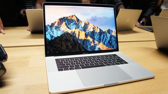
Image: LANCE ULANOFF/MASHABLE
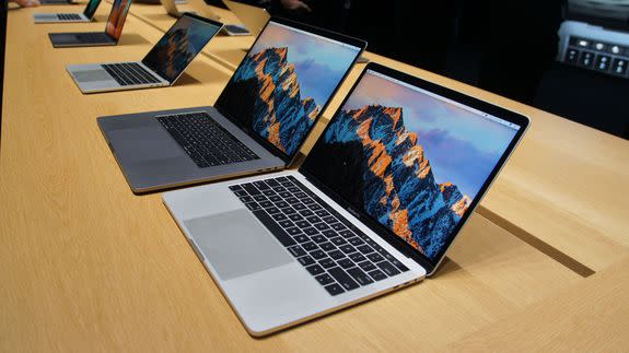
One couldn’t be blamed if, from the exteriors, they mistook the new MacBook Pros for one of the older models. Yes, they're smaller, lighter and thinner than ever, but the materials (aluminum), placement of the logo and even keyboard are quite similar.
But that’s only at first glance. Even in my brief experience with both devices, I could see and feel the myriad important changes. There are now two USB-C/Thunderbolt ports on each side for data, connectivity and charging. One port to rule them all, as they say. The only other port is the 3.5mm jack. Don’t you wonder how hard some in Apple campaigned to get rid of that port, as well? No more USB-3, no HDMI, no MagSafe. It’s port austerity. Is this a good or bad thing? I’d need more quality time with the laptops to tell you.
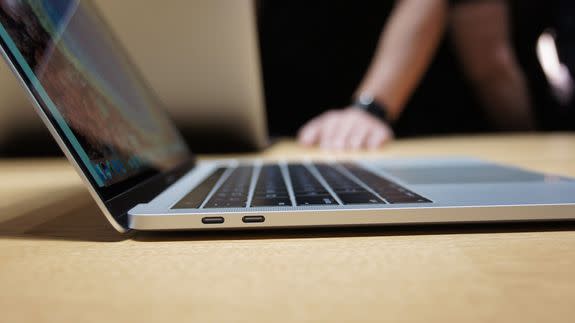
Image: LANCE ULANOFF/MASHABLE
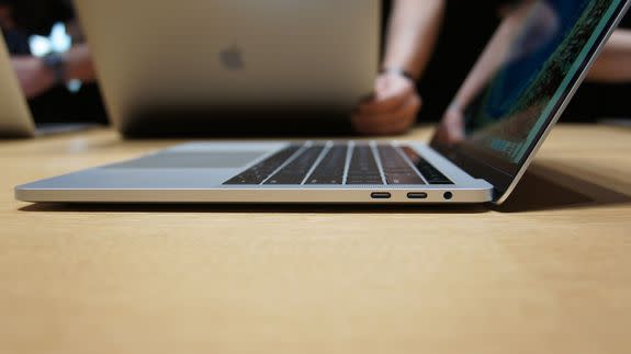
Image: LANCE ULANOFF/MASHABLE
On the lid, which is thinner than ever and houses a brilliant-looking Retina display, is the familiar Apple logo. However, the lid is now so svelte that Apple can no longer backlight the logo. It looks more like the gleaming silver one on the MacBook ultraportable introduced last year.
Under that hood is a familiar-looking keyboard with some new technology underneath. When I ran my hands lightly over the black keys, they felt nearly flat. However, once I started typing, there was decent travel. Not as much movement as I get on, say, the Surface Pro 4’s Keyboard Cover, but enough to make it a satisfying typing experience.
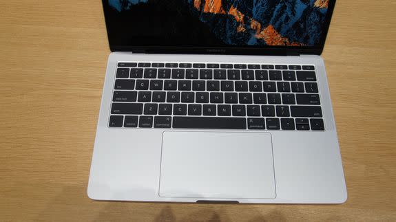
Image: lance ulanoff/mashable
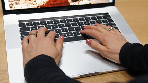
Image: LANCE ULANOFF/MASHABLE
Right below the keyboard is the now massive touch pad with Force Touch haptic response (which means the rectangle doesn't actually move, it just feels like it does). It’s so big that, when my hands were on the keyboard, it was impossible to not have half my palms hover over its glass-covered expanse. I worried that I might accidentally touch it, but that did not happen. Again, it’s a design feature I need more time with to properly evaluate.
Touch Bar
Above it all is the full-width, roughly half-inch deep Touch Bar. This is a multi-touch, Retina OLED display that, in my experience, appears to have almost as much functionality as your iPhone touchscreen.

Image: LANCE ULANOFF/MASHABLE
First of all, the Touch Bar surface feels almost perfectly designed for touch. It has a slightly matte finish that allows your fingers to effortlessly slide back and forth over it. This is critical, since many of the features you’ll use on it require a finger slide gesture. There is no haptic response, but I found that, even in my brief experience, you’re often looking at the large screen when using one of the controls on the Touch Bar.
The benefit of having a screen over the traditional row of function buttons becomes obvious the moment you start using it. The Touch Bar is always contextual. It is constantly changing depending on which app you open.

Image: LANCE ULANOFF/MASHABLE

By default, it’s rather spare: just a virtual escape button on the far left and a control bar on the right featuring screen brightness, volume and Siri. You can customize the bar by literally dragging and dropping icons from the big Retina screen to the tiny Touch Bar below. This was easy and quite cool
Open an app and the center of the Touch Bar adapts to what's on the screen. In the case of Photos, you get the scrollable thumbnail view. I just slid my finger back and forth over it to change the full-screen images above. I could go fast or slow. Just like the Photos app on the screen, the Touch Bar offers the option to favorite, rotate and edit each photo.
When I selected edit, the Touch Bar changed yet again, offering me tools; if I chose one, a slide control appeared. You slide to alter your image and then touch the "Done" button when you’re finished. After glancing at the Touch Bar, I found myself watching the screen as I moved my finger, until I had just the right edit setting. It felt, in a word, intuitive.
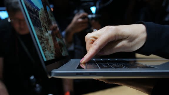
Image: LANCE ULANOFF/MASHABLE
While Photoshop wasn’t pre-loaded on the MacBook Pros I tried, I did find Final Cut Pro. Once again, the Touch Bar changed to accommodate new tools. I could see a whole tiny little timeline and even scrubbed through video with my finger as the app and big screen kept pace.
I also used the Touch Bar to swipe my way through open tabs in Safari. No telling how this would work with Chrome, though. Since developers can write to the bar, I assume it might work similarly – if Google cares to code for it.
Finally, I fiddled around with email and emoji. When typing my response, word suggestions appeared right on the Touch Bar. I tried seeing if typing and touching those sped my typing, but soon realized that I need more practice with the new hardware to know its true impact.
The emoji, but the way, looked especially good on the Touch Bar, and who doesn’t love emoji?
Two things that could be an issue for users: In the brightly lit demo room, the Touch Bar’s screen – even at full brightness – seemed a little over-matched. Also, the screen resolution feels designed for those with young eyes. The image thumbnails are, for instance, comically small. I assume they are just for glancing reference, but then why bother? Would photo numbers or dates make more sense?
Touch ID
The other biggish change on the 13-inch and 15-inch MacBook Pro is the new Touch ID. It’s a black button that sits on the far-right side, next to the Touch Bar. Since my finger was not registered with the MacBook Pro models I tested, I couldn’t unlock them this way. I did, however, get to watch someone register a finger through the button. It appears to work almost the same as Touch ID does on the iPhone.
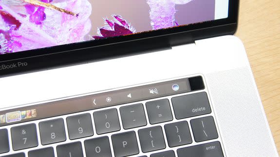
Image: LANCE ULANOFF/MASHABLE
Also, in case you’re wondering where the power button has gone, it’s right there: the Touch ID is also your power button.
Size and other matters
There’s about a pound of difference between the 13-inch and 15-inch MacBook Pro, but since the latter weighs just 4 pounds, it feels light, at least compared to the last MacBook Pro. That, in turn, makes the 13-inch MacBook Pro feel like a 3-pound featherweight (though the true featherweight is the ultralight, 1-pound MacBook).
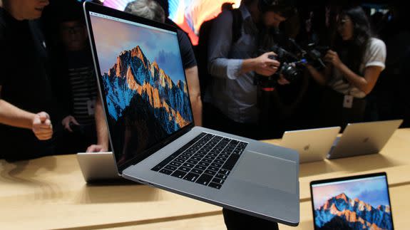
Image: LANCE ULANOFF/MASHABLE
Overall, these appear to be expertly designed, powerful portables with big, brilliant, color-rich screens that will appeal to professionals, students and creative types. The extra performance will interest upgraders, but I suspect that laptop users of all stripes will want to take a much closer look at the innovative Touch Bar.
